 Limitations exist on mobile devices with regards to navigation of websites with ‘drop-down’ menus. A touchscreen, such as a iPad does not have a cursor you can move around the screen with your finger to ‘hover’ items. Since most drop-down menus use the hover event of the cursor to show sub-levels of the menu, you are unable to access the sub-levels using a touch screen device the way most drop-down menus are created.
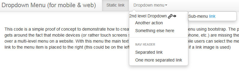
The following sample code is a simple proof of concept to demonstrate how to create a dual purpose drop-down menu using bootstrap. The purpose of this code is to create a multilevel menu that gets around the fact that mobile devices (and touch screens such as iPad, iPhone, Android phone, etc.) are missing ‘hover’ event functionality that the cursor of a computer mouse provides. With this menu the main text is wrapped in a ‘div’ tag so mobile users can select the menu item, but not go to the webpage it links to. The actual link to the menu item is placed to the right and in my example I use both link text and an image icon to represent the link. This allows both selection of multilevel menu items to drill deeper into the menu while also providing links to the menu items in parallel.
If you want to play with the code you can find it here (until someone edits the code):
http://www.bootply.com/Gul3oTUqOf

 pgale scripting library hosted by UNC Source Control (Git)
 How To Improve Your WiFi Service
. Sometimes however we need to look to our devices.") When Good Wireless Feels Bad
When Good Wireless Feels Bad Add contact info to your phone lock screen